An overhaul of the Article Creator UI.
Shifting items around into more logical groups.
Screenshots below.
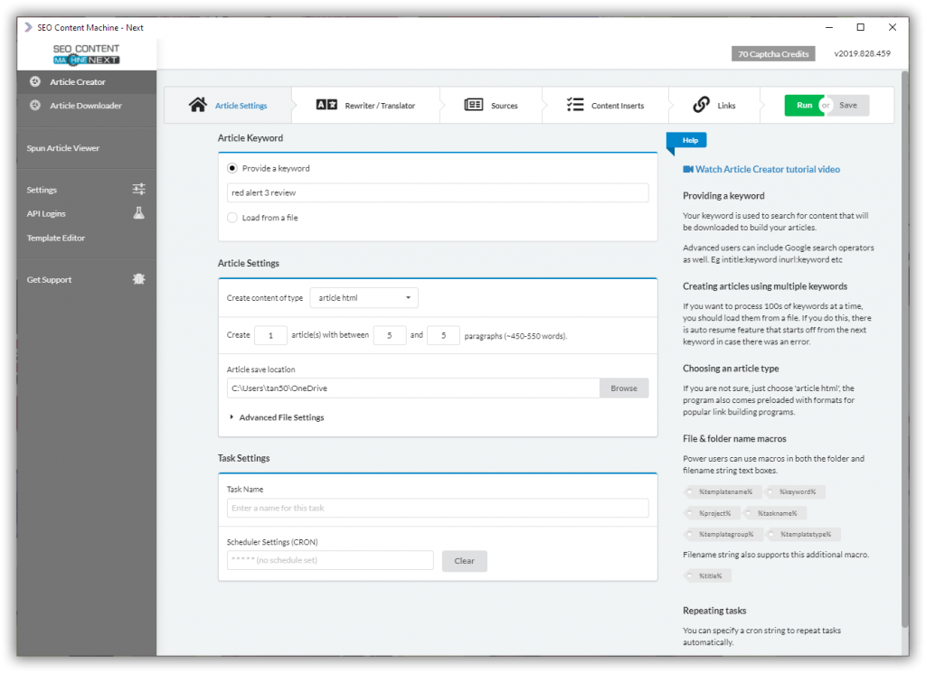
CRON scheduling feature has been moved under task settings. It no longer appears on its own tab.
Task name is optional setting, if you don't set it… SCM will use the keyword or keyword file as its description in the task list.
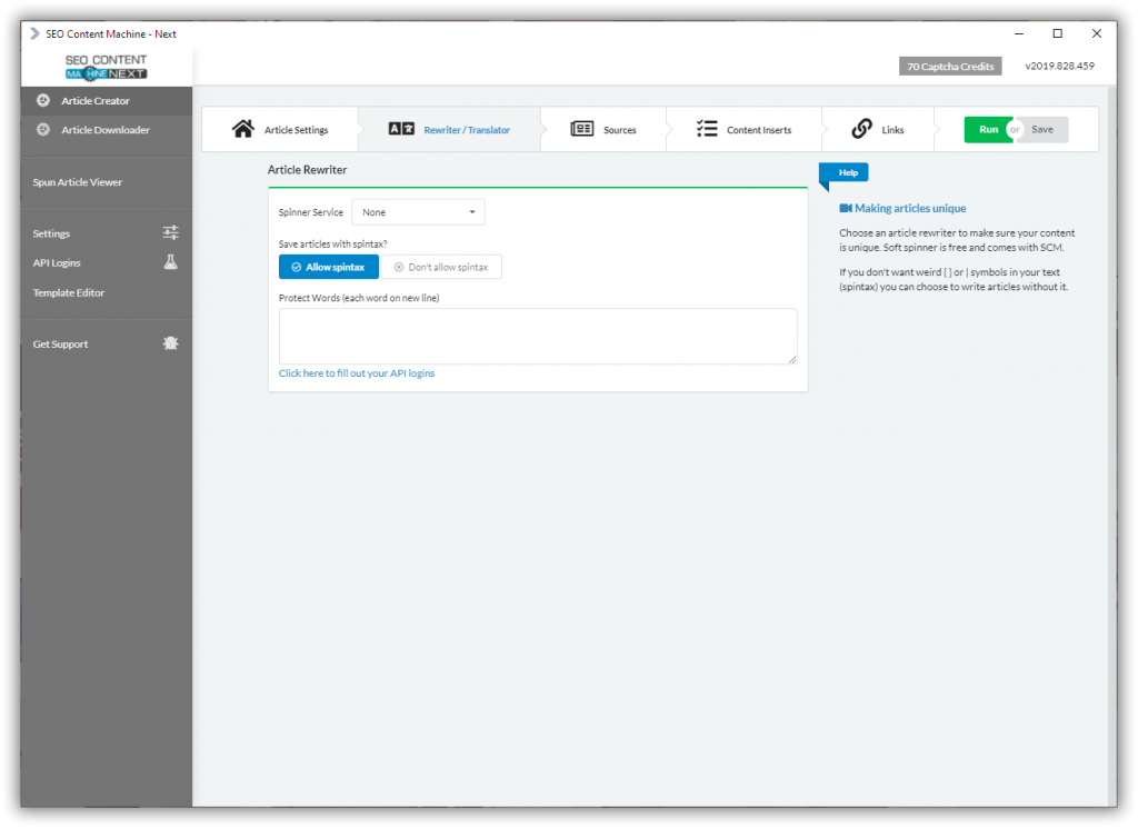
Will be adding translation services soon, they will appear under rewriter options.
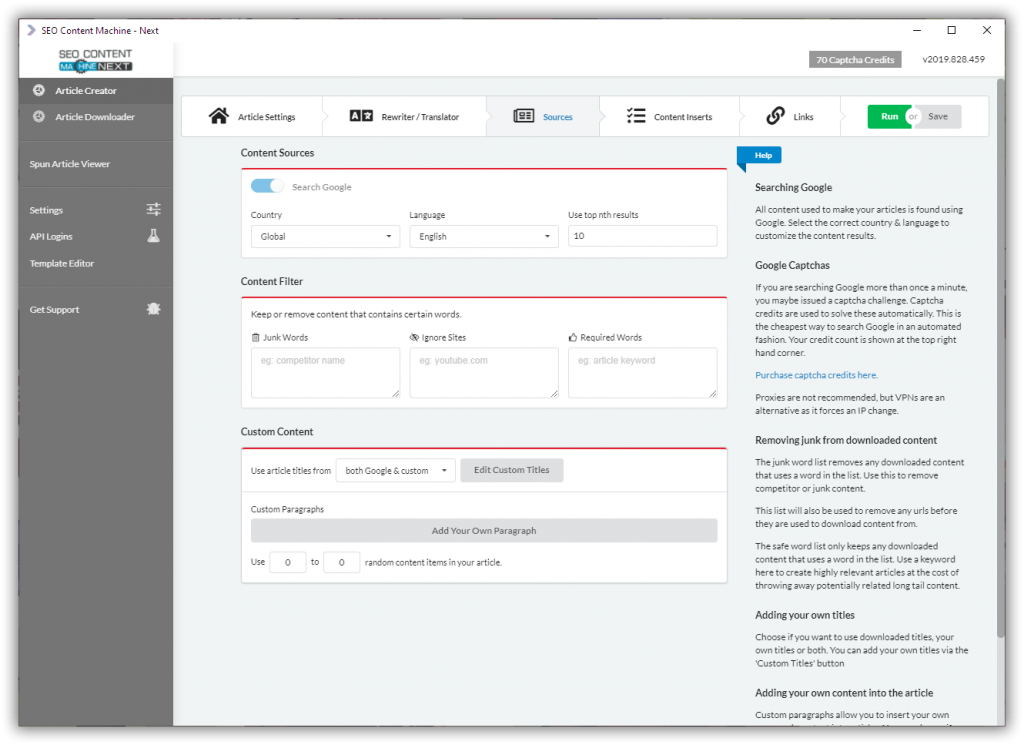
All options related to customizing and editing content appear on this ‘Sources' tab. Google still is and will most likely be the only content source.
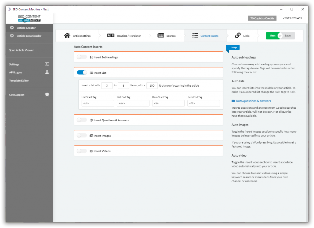
Anything to do with inserting extra content that isn't part of the article body, has been placed into the ‘Content Inserts' tab.
Insert subheadings, lists and QnA have been placed togther with both the image and video insert options.
Now you only have to visit one tab to decide what additional content pieces you need to have auto inserted for you.
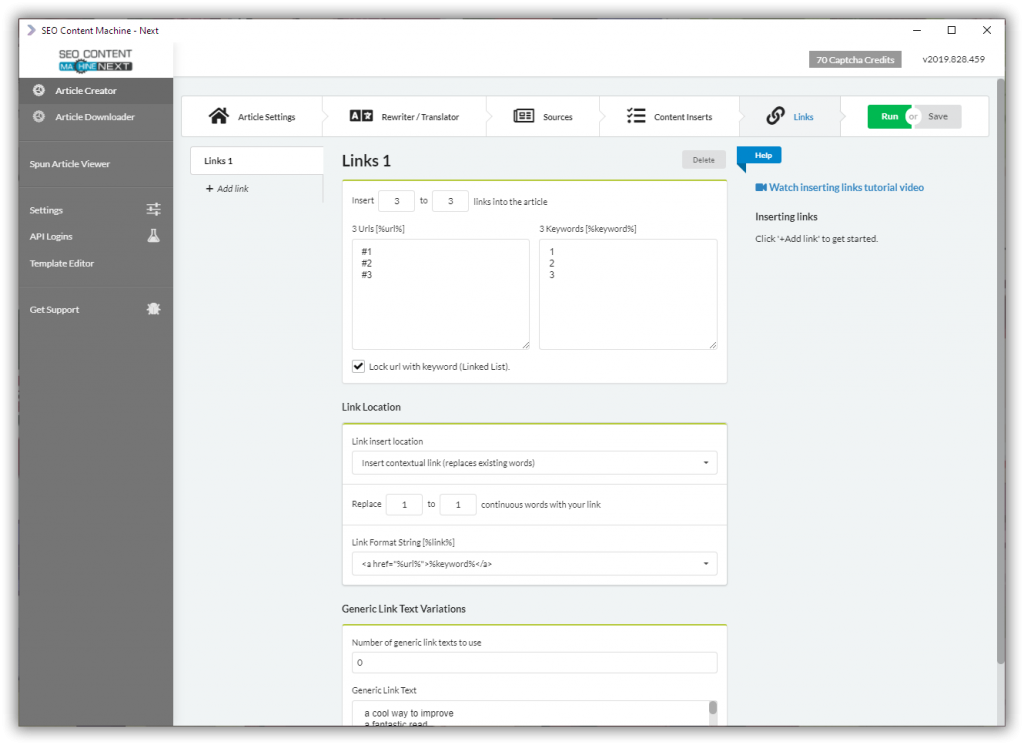
Insert links tab has not been changed.
All tabs now have an icon associated with it to make it easier to identify.
I have even added icons for all content inserts.
Where possible I will always try to find new ways to group and or merge/remove UI options to streamline things for users.
