On screens with width less than 1200px, some UI items in the top nav bar aren't visible.

To make room…
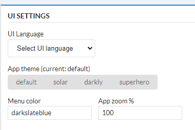
The UI language settings drop down has been moved out of the top nav bar and now into Settings.

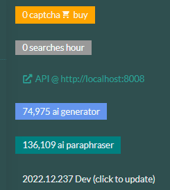
The top status bar has had some items shifted.
The captcha credits label is now positioned next to the searches per hour metric as they relate to each other.

Now when you compress the app down to around width 800px in size, the bar will resize down correctly.
You can even compress it all the way down and items will start stacking.


The (click now to update) text should always be visible and clickable no matter how small your screen.
Another fix is that new task buttons correctly shift down its position to take account of the new resizing nav bar.

